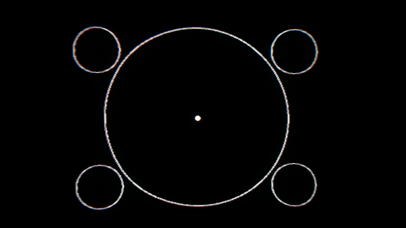
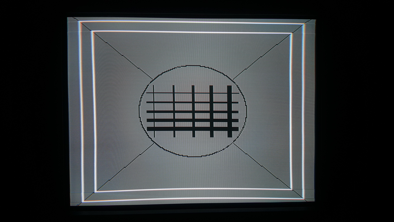
My understanding is the red squares are in the area usually overscanned, with the white area being the ‘safe-zone’ but I keep them visible on most screens and most pictures online keep them entirely visible.
My benchmark for this is the status bar at the top of the screen in Strets of Rage, that thing is positioned way higher than most games and if you assume normal overscan it can easily be shifted up and out of view.
It depends on the hardware and the game. I tend to be slightly over-inclusive, even if it means seeing some unintended garbage at the edges of the screen. On my CRT growing up, I used to be missing content completely due to overscan… I hated it and didn’t understand which the top of the text was cut off when playing Sonic Spinball.
So now, I adjust once using the hardware most susceptible to overscan (Saturn I think?), and just leave it for everything else even though it sometimes gives you a little black border around the edges.
Come to think of it, does anything out there let you load overscan setting profiles on a per-system basis for a PVM?
Not that I know of but would be happy to find out if there was. Is the one thing the OSSC solution will always have over playing on actual CRTs. Is also why I tend to try to adjust for all the screen space I can get since I’m fine with seeing the garbage a bit if it means I can still get the “full” screen when switching between sources without having to readjust. I also find some of the garbage charming, like on the Sonic games. :3
Anyway, remote arrived and dicked around in the service menu a little. Didn’t have time so just took down the original settings so I could revert back and saw what the limits of the adjustments were. Seems I’ll not be able to get the red line at the top of the grid pattern since the screen hard cuts out on it even when moved to the visual field, but that’s fine.
I’ve found that different consoles position the image differently overall. I have the 240 suite on a Genesis cart and at first I adjusted that test pattern exactly to center with nearly all the red outer boxes visible. But then PS1 games were shifted far to the right and SNES games slightly to bottom. So I split the difference. There’s a sliver of black on the left, right and top of each now but I don’t much notice it.
Also - look up SocksFellOff’s blog post about calibrating his 310. Very helpful and right to the point. He focused only on what’s important.
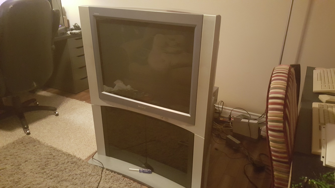
Congrats, stand and all. And I know that feeling since I’ve had multiple active tabs up for over a year on several listing sites that I’ve refreshed several times a day and finally just saw the first one I’ve ever seen listed. What size you get?
Person that owned the one I just got was a rescue dog owner and the base of the stand is all chewed up. Looking into ways to repair it now but not really sure how to go about it.
It’s a 32", the size I would have chosen above the others, so I feel especially lucky.
It’s in a basement with a staircase that has a turn in it, so it’ll be fun getting out of there. I’m bringing a friend and picking it up this afternoon.
I checked the convergence by opening up the menu, and it looks good, but I can’t really tell how the geometry is. If I’m not happy with it, I think it’ll be worth doing what I can to repair it.
Don’t even know what my ideal preference for size would have been since I knew that it would never be a choice so it’s better to not think about it.
As for weight, it’s amazing how much a difference it is between sizes. The bigger one is like 250 and the smaller is 115. Watch out because they are very front heavy so can tip and get away from you if you aren’t prepared. Worse thing is the odd shape so it’s hard to just put one side up on a stair at a time. Not sure about the 32" but the 36" at least has some nice “handles” built into the side that make getting a grip on it easier.
Only other thing I would recommend is pulling off the little front controls cover thing before moving it to protect it. Thing cracks and breaks very easily.
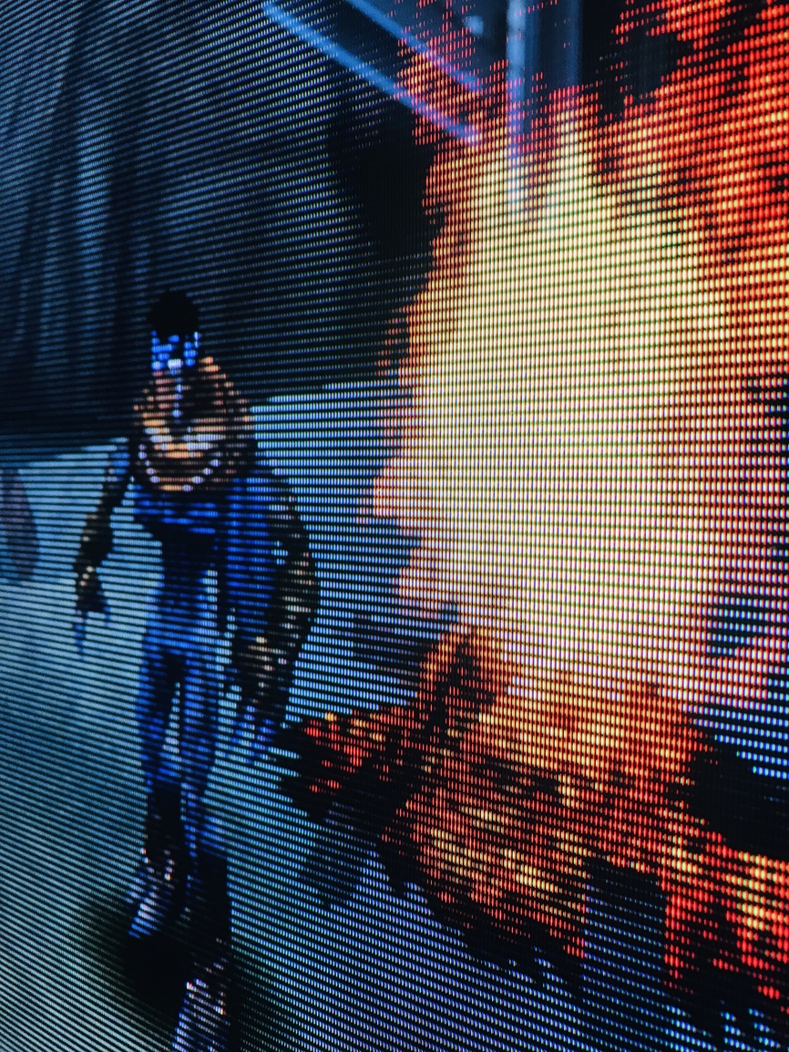
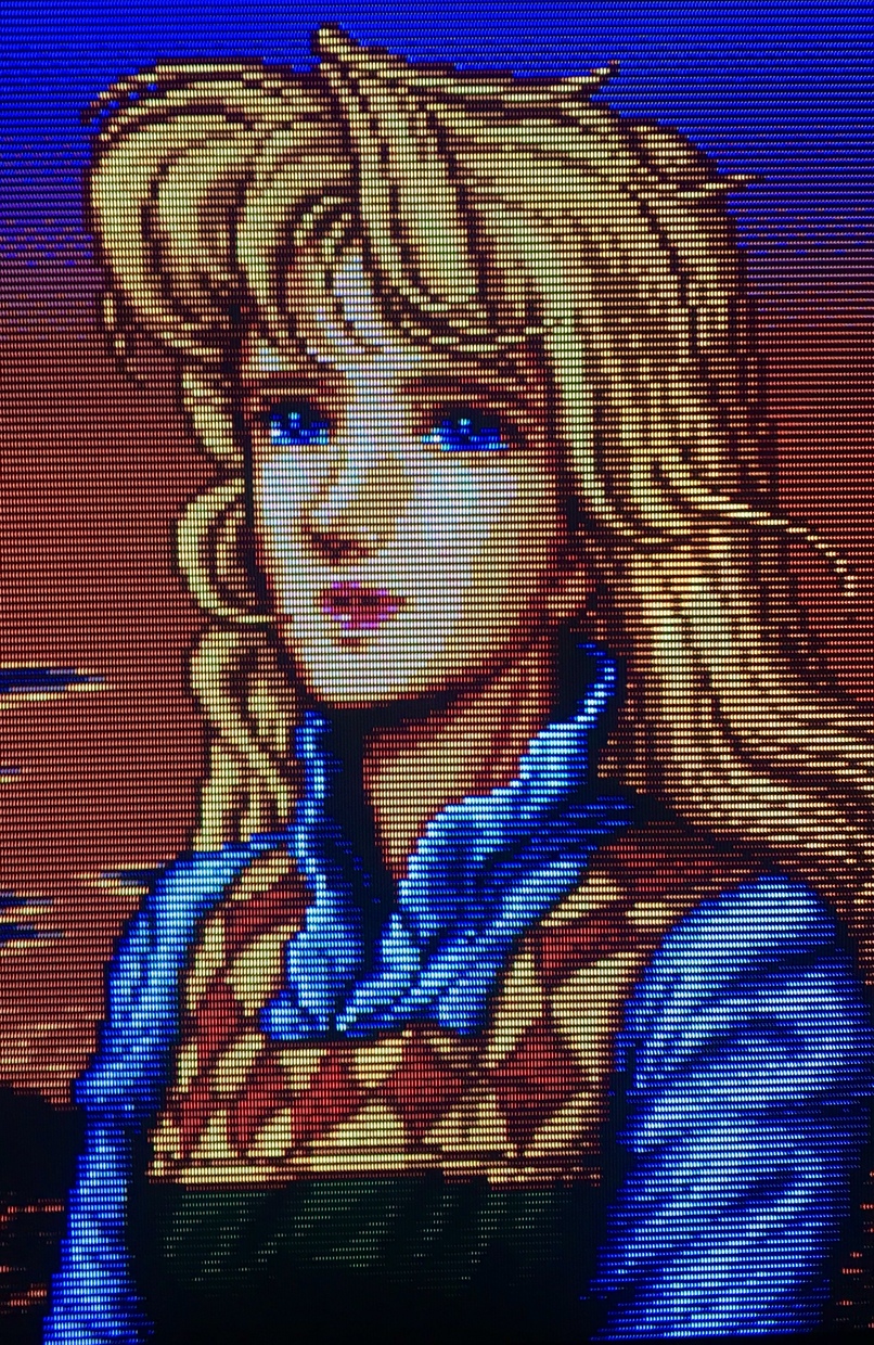
Here’s a few more shots from my KVAR25M31, all through RGB.
I’ve nearly got the set tweaked how I want it, I’ll do a write-up on the set soon as while it visually looks like the lauded 310 it probably has more in common with the 320 in terms of its features.
Convergence is pretty good, but it’s out a bit in the corners. Geometry is okay, but it’s bowed in on the sides. I think I can fix this in the service menu.
It looks very sharp, and the overall quality of the picture is impressive.
I use a Shinybow SB-2840 to convert SCART to component for other consoles, but for my NES, I installed the component board and component ports for the NESRGB.
I’ve got the shinybow as well and figured that is what you were using but you went the extra mile. Guess I didn’t have the foresight to mod my NES for component. Looks clean as fuck too.
It’s a catch-22 in a way. Now the NES is my only old console with component instead of SCART.
When I use the 1st component input on my TV, it’s the old consoles (Shinybow), and the 2nd component input on my TV is the newer consoles (straight component).
The NES is now grouped in with the new ones on the 2nd input. First world problems.