Question is straightforwarded enough. Are there any times where a version of a game may be stripped down to 4 colours and 2 shades of black or lack all manner of fancy motion blur and bloom effects, but as a result, you actually like the resulting look better?
My go-to example is the Saturn version of Hi-Octane. It removes the textures from the vehicles, which is objectively a pretty unacceptable downgrade when the base game is already so basic and ugly, but as it turns out, I actually kind of like the stripped-down Star Fox-esque cars better.
Another is Truxton on Genesis. The sprites were well-translated to the Genny’s hardware and I thought the gritter colour palette actually fitted the tone of your average Toaplan shooter better than the almost pastel pallete of the arcade version.
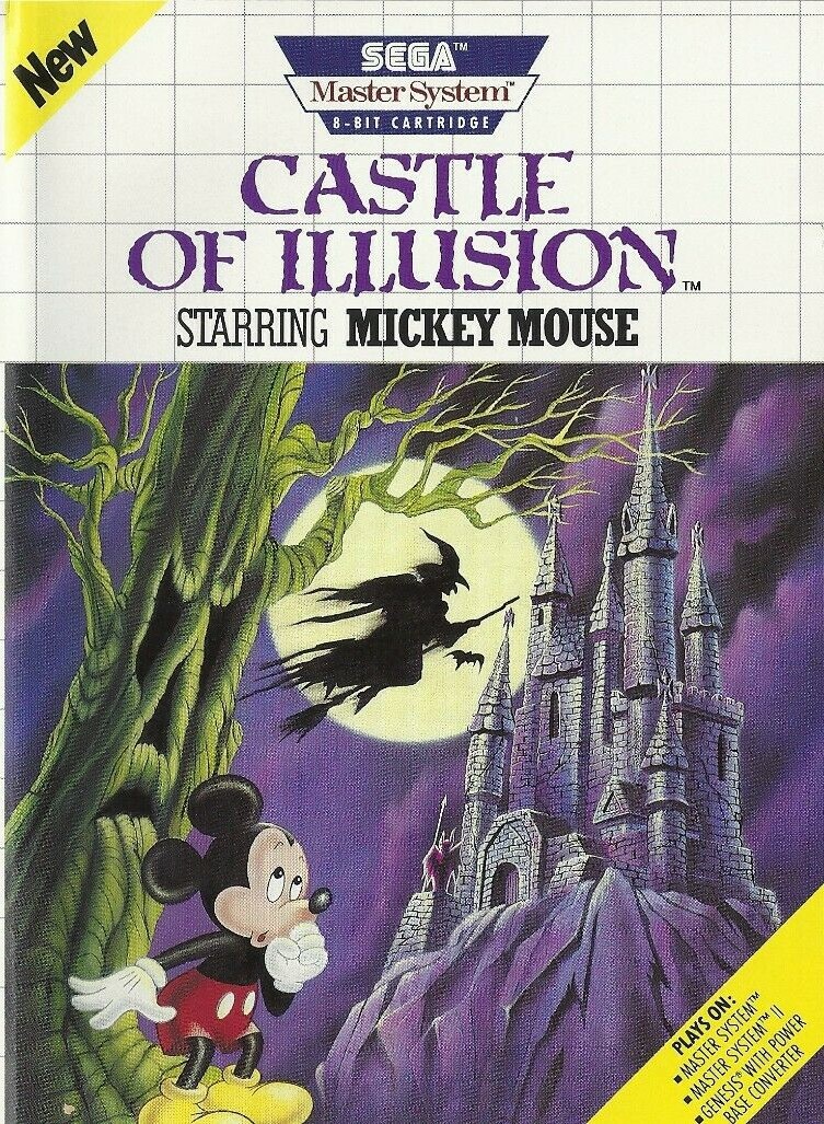
I know that they are actually different games, but the Master System version of Castle of Illusion is a much more fun, polished experience. It’s got better puzzle elements, faster gameplay, and better platforming imo.
PS1
The first version I played, so probably have more fondness for it.
Extra points for having the R34 Skyline in the Japanese release. And the Ford XR8 and Holden GTS in the Australian version.


