So here’s a fun nerdy thing I’ve been doing for a while this year: Doctoring screenshots of what hypothetical ports to other retro systems might have looked like. It was my buddy Alianger whom started doing this with games adhering to Master System colors which inspired me to give it a shot. Not only is it a fun exercise of “what ifs”, but when you take the system specifications into account it also teaches you a lot about the types of challenges artists had to face for these projects, and how the choices they made around the limitations informed the way the graphics ended up looking.
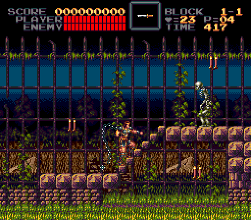
Starting off here with Super Castlevania 4 on the Genesis/Mega Drive (Factor 5 actually had a proof of concept port of SCV4 to the system, complete with the rotating room effect, which they pitched to Konami but nothing came of it).
Most know that the Genesis displays a total of 64 onscreen colors, but what most don’t know is that it’s technically sub-divided into 4 independent 16 color palettes. Each tile can only pick colors from 1 of these palettes at a time, so they cannot overlap with eachother which is really much more of a limitation than just the total cap of 64.
The first optimization pass I did was to make Simon, the GUI, candles and items all share the same palette, which is often how Genesis games structured the color distribution. Then for the level art palette I worked out a kind of two tone shade from dark purple to green to yellow which all could be partially applicable to the brickwork, grass, and fence all in one. The background layer was the hardest part to optimize, and I ended up taking some artistic liberties by redrawing the sky gradient to work better with a lower pool of colors. Also managed to reduce the total colors used on both Simon and the skeleton enemy without any perceptible loss in detail, giving me some more important headroom to work with. The screen itself isn’t really maxing out the color usage since you gotta keep in mind to not work in a vacuum and also consider the elements in the rest of the level not shown.
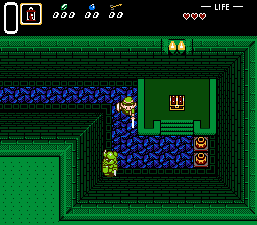
And here is A Link to the Past, NES style. I’m not really as experienced with what the “rules” are for NES so I’m kind of working in the blind here. I did want to consider problems like bandwidth limitations when going from 16- to 8-bit so I made a black bar to obscure part of the screen and placed the UI there. I do know that the NES has a total of 16 onscreen colors with each tile choosing from 4 (3 if you want the object to have transparency). Link’s sprite technically goes over this limit, but I’m banking on this being solved by having 2 overlapping sprites similar to how they get the skin tone for Mega Man’s face. I used Star Tropics screenshots as a reference for what color combination to use with the extremly limited NES master palette.
I already love this thread. But I do think that Zelda shot us a bit too colorful for some reason but can’t put my finger on it. Maybe it’s actually the size of link’s sprite?
Is it because of the sword? I’m kind of treating the sword, shield, and the eyes as an extra sprite layer, which is what allows a layer of white on the character alongside the other 4 (brown, beige, green, transparent). This is what some NES games do to get more advanced looking sprites on the system, like Mega Man which uses a separate layer for the face, and also the Battletoads characters.
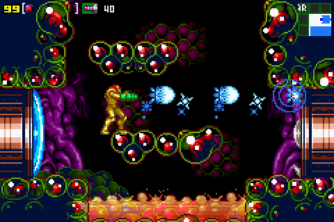
12 colors onscreen. Even that might be pushing things, considering there are no other real items or enemies displayed and those need colors too. Again, Samus’ green visor is treated as its own sprite here.
Shots like this make you realize that a lot of the “jump” from 8 to 16 bit graphics was not just driven by technical improvements, but also artistic improvements. Some of those chinese NES bootleg versions of SNES games look amazing for an NES, simply because developers had gotten so much better at making sprite and background artwork. You can also point to late NES titles like Kirby’s Adventure or Gimmick which look to me more impressive than some early SNES games like FF4.
There is an element of art improvement true.
But if it were designed for Famicom, the art and game as a whole would have been designed differently. That dark contrast Super Metroid shot would not look very good over RF to an 80s TV IMO, typically if you have a dark background, you need the edges of the sprite to be light, or vice versa. Only very carefully designed sprites could handle dark and light backgrounds.
Also wouldn’t Samus have to be 3-4 sprites to be that big?
Fo sho. And of course you couldn’t get diagonal scrolling without extra hardware in the cartridge. Yeah, probably 3 or 4 for Samus alone, which of course means lots of sprite flicker if you wanted to keep the same enemy count. And of course something like Ridley wouldn’t be possible without some technical wizardry.
Anyway, to me it’s the background tiles that are more striking in their evolution.
I’ve made peace with the probability of never seeing a real picture of Virtua Fighter 3 on Saturn, but I’d love for someone to make an impeccable mockup.
Actually, I’m basing the aesthetics on the ultra grimdark, noir style of graphics which developers like Sunsoft and Natsume gravitated towards near the end of the system’s lifespan, since it turned out to complement the color limitations really well. There’s a few games on the system that use both very dark, silhouetted backgrounds with sprites using black shadows and linework. Your mind just fills in the blanks when the colors blend into eachother.
As for sprite sizes, the amount of tiles and such, I’m giving it some leeway there since that’s where devs could be more flexible using more advanced mappers. The important thing for me is to nail the distinct aesthetics informed by the system’s color limitations, which was not something you could work around.
You can always see the tiles more clearly in Fami, lots of ‘fading to black’ to hide it. That Shatterhand shot looks insanely good for NES though, goddamn.
Maybe if the Super Metroid background was plain black with some ‘highlights’ It would look more like NES? Similar to what Zero Mission did (although it’s obviously a vastly brighter and more colourful game).
Of course, that’s not accounting for any potential overlaps between colors like yellow that are reused on both background and sprite palettes and such, so in practice it’d be a bit more.