White logo on white theme here. Probably for the best
Heads up, black logos on Wikipedia pages are not showing up here visibly on the default black theme 
1 Like
We can wrap images in a quote tag to add a subtle background colour. Not quite ideal though…
And I think style change needed to theme for black on black?
Since I’m sure everyone wanted to post the developer of Street Fighter and Mega Man next, I’ll go ahead and do that for all of you… Letter K is for KONAMI
![]()
1 Like

Agreed! Unfortunately we get the new abomination from Wikipedia now.
I found an archive of new and old game company logos: http://logos.wikia.com but there is no nice way to embed as yet 
L = Loriciels
I only recently figured out what this name meant. The Oric was an old home computer, and these guys made a start with it. The referred to themselves as The Oric Guys, or L’Oric-iels. Genius. I love the animated version of the cat running across. In an earlier logo the cat is more kitten and plays with the red ball.
Notable games: DISC, André Panza Kick Boxing, and many more that have stellar graphics and quite average gameplay. Oh well.
I captured this back in 2016…

1 Like
M is for Maxis
For creating the Sim City series.
One of my all time favourite examples of breaking a game, or philosophy through game play, is the series of dystopian cities created by Vincent Oscala. Studying architecture in the Philippines, he set out to create a city with the largest population in Sim City 3000. The implications for the citizens are truly terrifying.
Magnasanti
2 Likes
Wow, love that perfect city. Crazy passion.
Yeah, the citizens live for an average of 37 years, and there are no cultural utilities apart from the smattering of parks. But there is a police station every few blocks.
Bleak.
Are you familiar with Chandigarh in Northern India? It was a planned city like this, by Swiss/French architect Le Corbusier in the 1950s. It follows this sort of regimented “grid” based city planning/design.
I once met a girl from Chandigarh at a party - she assured me that it all worked very well indeed.
The uniformity and pragmatism is intriguing, but I remain sceptical about it in practice.
Resisting the obvious N…
N is for NCSOFT. Heavyweight MMORPG makers, I care not for their games but they have a really nice logo, somewhat reminiscent of the N64 logo.
O is for Oddworld Inhabitants

I very fluid logo, and fits nicely with all the visual design choices of their first two games.
My first experience of FMV being done right was Abe’s Odyssey, and the PC version has much nicer controls than the PS1 port.
I should really play New ‘n’ Tasty.
3 Likes
P is for Polygon Magic
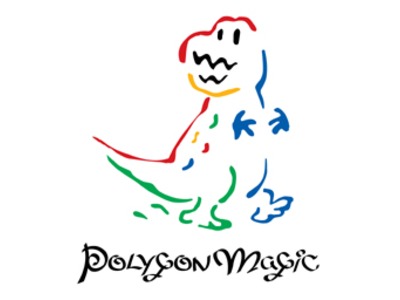
I remember them most for the Wii port of Ghost Squad, but it seems like nowadays they’ve gone the way of a lot of mid-sized Japanese developers (like iNiS, Acquire and Paon) and have shifted to mobage development to pay the bills.
Love their old logo though!
Wow, I have played Ghost Squad and have no recollection of that logo.
Sort of looks like Mario and Yoshi had a baby. 
Q is for Tetsuya Mizuguchi’s first venture away from Sega, Q Entertainment.
Bringers of video game synesthesia (I still love that cheesy over marketing ploy!  ) in the form of Lumines, Meteos and Child of Eden.
But synesthesia is an actual thing
I always get Q? mixed up with Dylan Cuthbert’s Q-Games
Me too. One of the companies also designed the XMB and PS Vita home screen interfaces and I keep getting them mixed up.