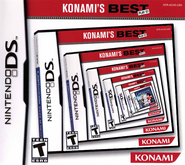
But what about those times where it was handled tastefully? In Japan, it’s not uncommon for publishers to have their own “best price” labels in addition to the platform holders, but I wanted to kick things off with the Japanese “Minna no Susume” releases on Wii.
I had no idea until today that the “Minna no Susume” (known as Nintendo Selects globally) packaging actually took on the form of a sleeve that goes over the original case and art. Classy!
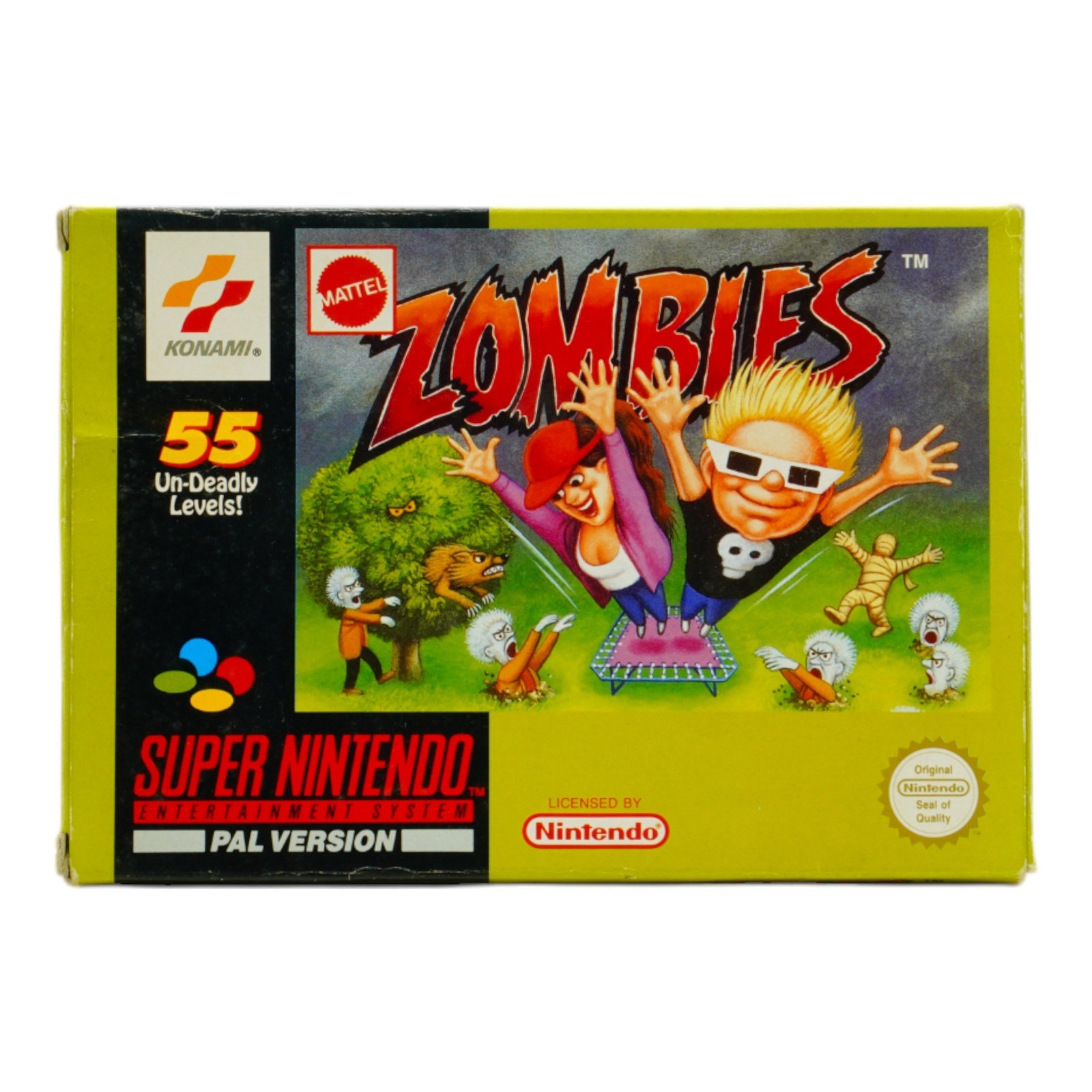
Always thought the Zombies ate my neighbours reprint missed the mark in art style too, with fantasy novel style realistic shading.
Why didn’t they just use the existing PAL box art if they wanted to drop the original b-movie poster style one? Not brilliant but looks more like the game.
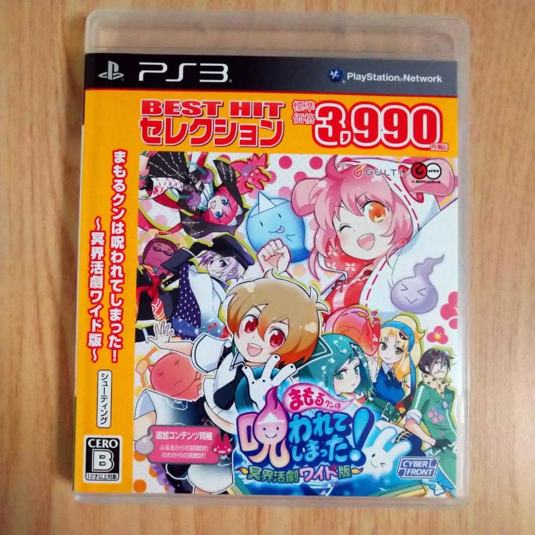
I’m slightly partial to the BEST HIT selection for some reason, I guess it’s just the left border that’s actually quite attractive somehow. had no idea Mamorukun Curse saw a rerelease under that label!
Beyond the boxart being too noisy, it sounds like you’re getting a Switch 1 game card with a download code in the box, according to Nintendo representatives…
It seems so unlike Nintendo to go down this route so I’m hopeful that it’s at least all the content on the card, or the license for the upgrade on the card.
Asking users to redeem a code just to have a Switch 2 game that “just works” is very un-Nintendo. But maybe the impact on preventing preowned sales made it worth it for them. I still can’t see it, so will remain hopeful.
Just crazy Nintendo itself hasn’t issued a statement while customer service reps have given conflicting information.
Ah, but is it only for Nintendo published games or all 3rd Party games. That they didn’t make clear.
It’s not also clear if the whole game will be on the cartridge.
I think ‘Nintendo Switch 2 Edition’ is a NIntendo first party branding. And in Nintendo’s case the whole game will be on the cartridge for all theirs.
I’d be guessing most other publishers will just release a new generation copy of their game, whatever the format. Like if they make a Switch 2 ‘Mortal Kombat 1’ it will probably just say ‘Mortal Kombat 1’ on the box.
There are Switch 2 Editions of Rune Factory: Guardians of Azuma, and an upcoming Tamagochi game from Bandai Namco. Civ 7 is also getting a Switch 2 Edition, but remains the only previously-released third party game to do so.