Box art game covers, no matter the game we all remember them. You can just picture it now. Drive to your local game store. You open the store’s door and your’e suddenly stunned with the sight of beautiful colours and patterns on cardboard and plastic boxes. Video game box art was the deciding factor of many of the retro games that we cherished today. Without the conveniences of checking metacritic or reading up a quick review, it was up to the box art to tell us “You want to play this buddy. Trust me…Look at how cool I am!” In essence, the box art defined a video game. The simplistic element of the system banner/logo, the striking hand-drawn or computer generated poster on the front that catches your eye, the gameplay screenshots on the back and - of course - the copywritten blurb that effortlessly tries to describe and highlight the game’s features all within a small word count. Perhaps some saw the box art covers as merely a marketing tool but to others it enhanced the gaming experience in such a subtle yet effective way. How else could we have taken the time to appreciate the elegance of the art behind games like the Final Fantasy series, the Metal Gear Solid series, Chrono Trigger and even the iconic Sonic and Mario games?
The topic sadly isn’t all puppies rainbows as not only did certain regions suffer from terrible box art while others got great ones (Resident Evil 4, Metal Gear Solid 4, Ico) but it has somewhat become prevalent that today’s video games either do not take the time and effort to create eye-candy boxart covers or they simply do not care. Whether its hand-drawn or even good computer-generated box art covers, part of me feels like this is now a lost art. Artist’s and designer’s works are left for the collector’s edition artbooks and maybe an obscure promo poster…maybe. But you know, so is life and all that. Let’s celebrate all the hand-drawn and pretty box arts in this thread! Post alternate versions, (tasteful) fan versions, your favourite ones, your least favourites ones. Post cool concept art. Whatever you feel deserves praise and critique.
To kick off this thread, I will be presenting my limited selection of “Good, Bad and Ugly” box art covers. Of course, these are simply opinion based and it is recommended for you to share your own cherished and loathed box art covers. Trust me, I’ll probably be forgetting a lot of gems so its up to you to share them 
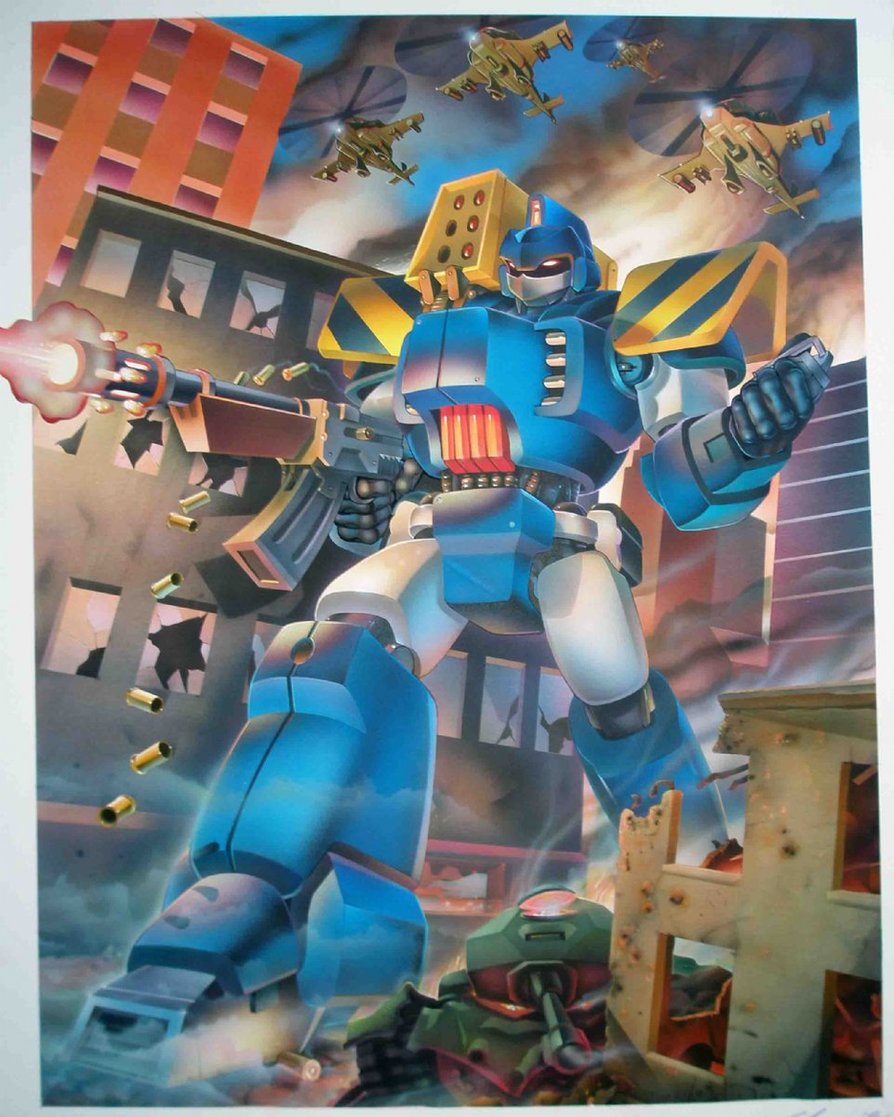
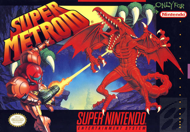
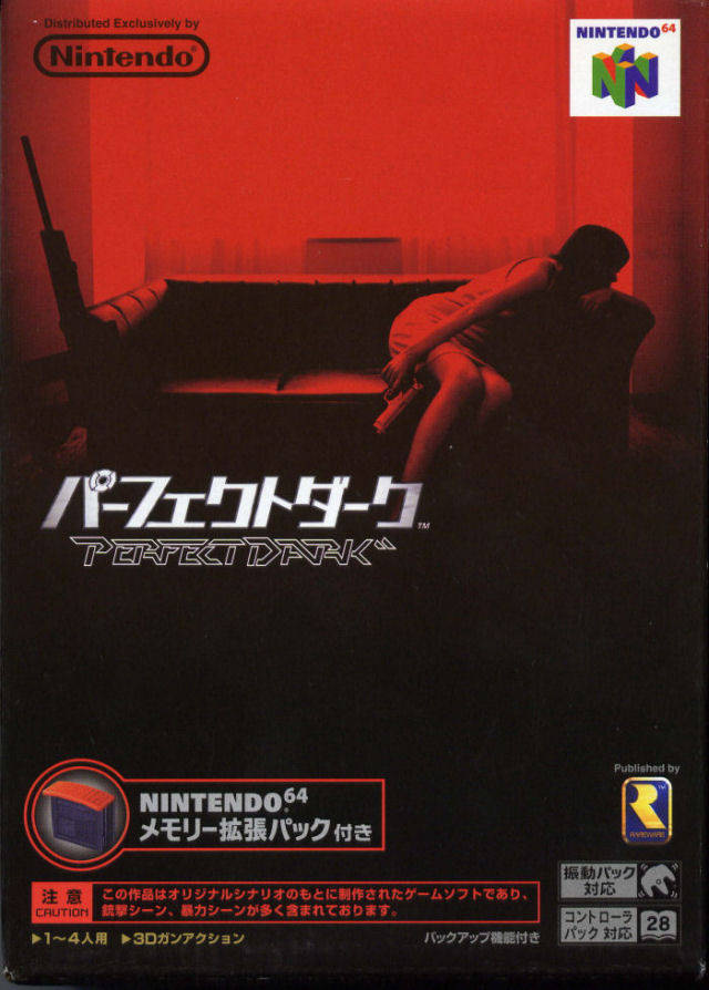
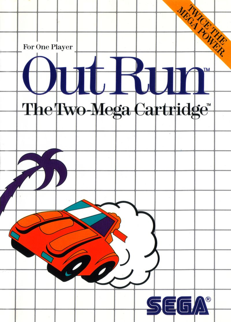
The Good


The Bad


The Ugly


Shoutout to NakeyJakey on youtube for motivating me to start this thread.


 It’s a common misconception, stupid internet disseminating the wrong info!


 wtf!? Surprised they haven’t used a Lethal Weapon cover to be honest.