Games where the character on the box art doesn't resemble the actual in-game character at all

Here’s the box art for the Amiga/Atari ST game Custodian.

With a cover like this, you’d expect the in-game character to at least look vaguely human, right?

Well…

As you can clearly see, that smiley-faced monstrosity looks nothing like the dude on the box art.

But it gets worse.

Just take a look at the game’s title screen…

So, do you guys have some more examples of in-game characters that look vastly different from the way they’re depicted on the box?

The sillier, the better!

5 Likes

funnily enough, I just literally came across this:

998541-zoku-the-legend-of-bishin-snes-screenshot-character-select

2 Likes


Is this cheating?

2 Likes

I think this one is pretty much the GOAT.

6 Likes

SR-71 Blackbird on the cover, the most badass jet ever created.

In game you get to fly a little red plane with either 1 or 2 props, depending on if it’s a cutscene or not.

4 Likes

Captain Dynamo

(just sold a copy of this)

image

image

2 Likes

Ironsword_cover

125482-ironsword-wizards-warriors-ii-nes-screenshot-one-on-one-with

Ironsword has always been a favorite.

6 Likes

Some really great ones so far! Keep 'em coming!

1 Like

The 8-bit home computer version of Athena has rather metal looking box art of a muscle-bound heroine fighting a hulking minotaur.

Anyway, here’s a toddler chasing a cartoon bear.

3 Likes

Awesome idea for a thread! Keep ‘em coming!

1 Like

Imagine you’re a kid in the eighties and you’ve just scraped enough pocket money together to buy a game for your home computer. Off you go to the store, determined to find a game that will rock your world.

When you enter the shop, your attention is immediately drawn to this bad boy:

An imposing monster with sharp teeth, bloody claws and freaking human skulls dangling from his pants? This game must be hardcore!

You rush home with the cassette in your hand, daydreaming of all the exciting adventures you’re about to embark on with your new reptilian pal.

And then you load the game and find out what it actually looks like…

Even the ghosts look disappointed.

7 Likes

Boulder Dash is an odd one. Nobody seems to be on the same page regarding Rockford, the protagonist of the game.

Here’s what he has looked like on various covers:

And here’s how he has appeared in-game:

So, what on earth is Rockford supposed to be? A miner? A robot? An insect? A cat? A rugged adventurer? Or just some cartoony dweeb in a striped shirt?

3 Likes

I appreciate that the 2020 release went back to the roots, kudos to that!

2 Likes

Here’s another one. The viking on this cover seems to be a healthy young lad.

Until you start the game and find out he’s a flabby Hägar the Horrible rip-off.

1 Like

That one’s wild.

"Lads, we didn’t get the license, someone let marketing know… "

1 Like

Pretty much all early box art that uses live models would probably classify.

Here’s one of my favorites from when I was young.

2 Likes

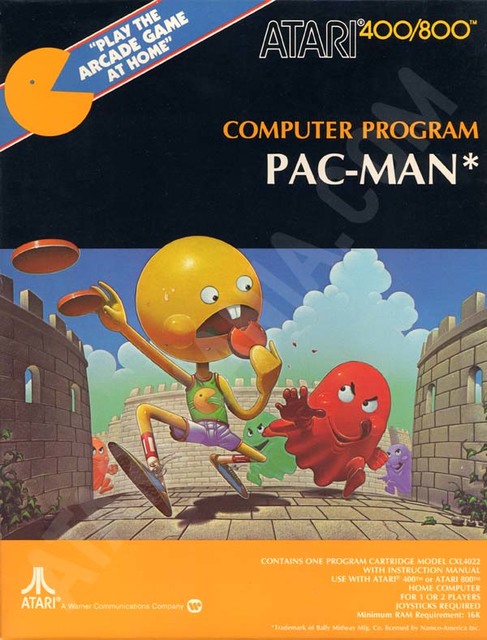
I guess this flowed out of the VCS era where you needed some imaginative fantasy novel type art to contextualise the extremely abstract primitive graphics. Most famously:

But then you enter the Euro/US PC space where lying on the box became an art form. Arcade graphics shown on the box for your c-grade hobby coded C64 port etc.

It’s why Nintendo went with pixel art in the US boxes, to be straight up with what the game contained.

2 Likes

What gets me here is that the hats don’t match… unforgivable!

3 Likes

Haha, I also had that game, but at least the box art of that version featured an Indiana Jones clone.

1 Like

Oooof yeah, so many C64 games with arcade/Amiga/ST screenshots on the box. That was a really scummy practice.