One thing that’s always fascinated me is the creation of fonts, lettering or typefaces using pixel art in games. It’s something that we don’t see utilised very often for functionality’s sake now that rendering resolutions have increased, but it was often vital that pixel art be used to design new typefaces in games back when the screen resolution was limited.
I find that the choice of font in games often helps lend it some extra atmosphere beyond other elements of the presentation or gameplay mechanics. For instance, the font designed for Super Mario RPG fit the game’s more comical dialogue better than if Square Enix rolled out the font used in Final Fantasy VI/III.
While the 3DS has a limited resolution display it is interesting to see that - like the PSP - many developers choose to downscale modern fonts instead, lending them a blurry look when done poorly. The Virtual Boy has a similar resolution display yet almost all its games used pixel art type faces, suggesting that colour output may have also been a limiting factor in creating an environment for the creation of pixel art fonts to thrive, alongside screen resolution and development tools.
What are your favourite designs? I’ll start off with one: Zelda: Link’s Awakening. Given the Game Boy’s limited resolution the italic text in this game still impresses me today. And while I can’t put it in words it certainly gives the game’s dialogue a different “feel” to Flagship’s take on the series with the Oracles games, which used a different pixel art font.
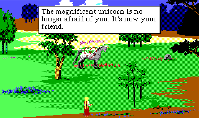
I was always a fan of the two distinct fonts in Sierra’s EGA SCI games, such as King’s Quest IV, Quest for Glory, Police Quest 2, etc… To me they always seemed like they were designed to really show off the 320 x 200 resolution, considering Sierra’s previous engine, AGI, had rectangular pixels and therefore their engine was for all intents and purposes 160 x 200.
Here’s some screen grabs from KQ4 to show off the two separate fonts: one for the “narrator”, and one for cutscenes and dialog.
How could I forget this one? I particularly like how Nintendo’s localisation team picked a similar looking font for Golden Sun, given it was in part a spiritual successor to Camelot’s line of Shining RPGs at the time. It’s been redone to look great in smaller text boxes.
Unfortunately the GBA remake of Shining Force isn’t so faithful, but it does somewhat fit the fairy tale atmosphere still since it’s a serif font.
Great topic. Fonts are one of those underappreciated details that can really make or break a game for me. Mobile ports of classic games seem to screw this up all the time.
I really like the font used in the US version of Dragon Warrior 3 on Game Boy Color:
Made much better use of the limited space than the one used in the previous Dragon Warrior games on GBC:
It must just be a commercial font intended for low pixel density displays because a few years ago the bus system here switched over to using the same kind of font for their stop displays.
I’m on mobile and can’t easily post a pic but something about the text in the SNES Lufia games always grabbed me. I think it’s just about the only time I’ve ever actually noticed fonts in a game…