The situation is a bit more nuanced. There are two things very obvious in these comparison shots. There is significant black crush in the CRT shots. Look at the dark areas, a lot of detail that is in the image is lost because it’s being displayed as pure black. Another thing that really stands out here is the color temperature. There is a difference between how monitors and TV’s come calibrated from the factory between the west and the east (japan). It’s a kind of cultural thing where in Asia they’re calibrated towards the blue, giving a much cooler image. You can notice this when looking at some of the wooden elements in the last shot above here, where they exhibit a more purplish tone, and the shadows in the back give a more blueish sheen. Both of these things can be adjusted by using the sliders available in your graphics card control panel, or the OSD in your monitor/TV. I don’t recommend crushing blacks this much though.
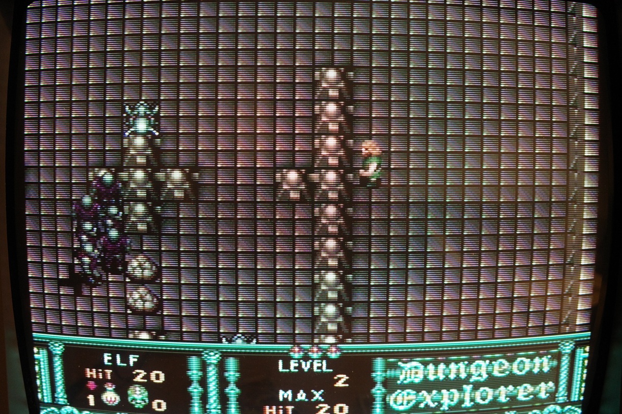
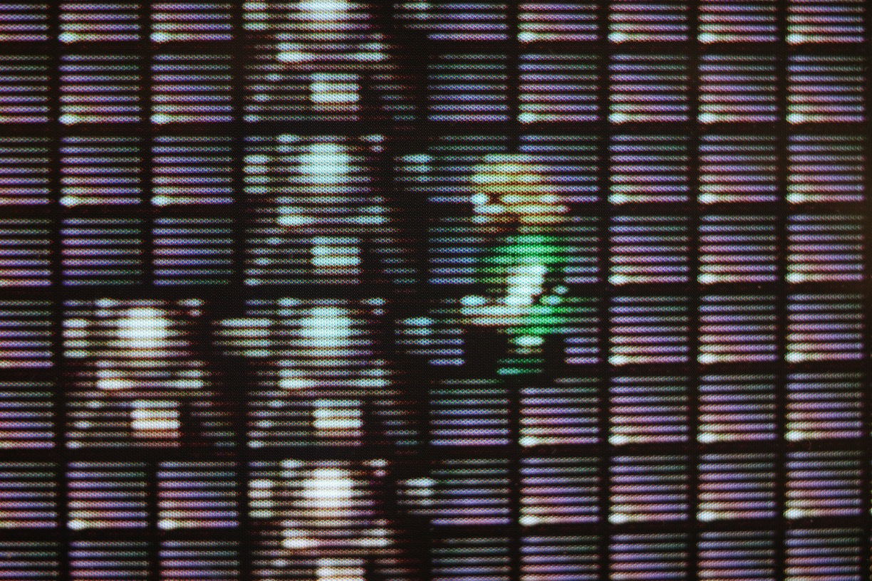
Another issue is the image continuity. Zoom in on the CRT shots, and you see every phosphor group being interrupted on all sides, and a bigger CRT will give distinct scanlines between each row of pixels.
This is also something that can be compensated for through software, or by using a display with similar properties. Remember, not all LCD"s are equal.
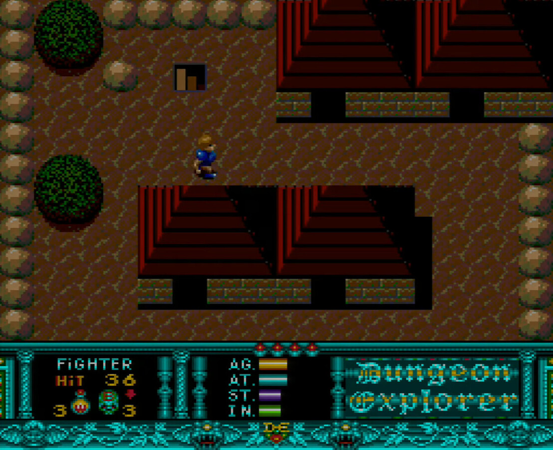
I’d like to close my statement with a closeup shot of my 480P EDTV, which has really nice large pixel segments with plenty of black space framing around them. I’ve made adjustments on both the display and PC side over time to approximate my ideal CRT reference point for titles like this.
This is true, I really enjoy the slot mask look. But with modern LCD’s the pixels are so small, and there is hardly any gap left between them. That’s what actually makes this low res 2d artwork look so terrible on them. But as I said, there are software solutions for this issues. 1 single white pixel in the source material does not have to be translated into a 10x10 uninterrupted white slab as some kind of inevitable torment.
Well put. A big deal is often made over pixel doubling or tripling being close to ‘native’ because it’s integer scaled, but in practice it rarely produces accurate results. At 9x scaling (pixel tripling) or even 4x (doubling) the gaps between neighbouring game pixels aren’t perceivable to the human eye, so you just get an overly sharp jumble of squares next to each other, when designers instead saw pixels as dot points that would be separated by a visible pixel grid, or by scanlines.
The charm of the CRT era and its free anti-aliasing will never be lost on me. It still looks amazing… and correct. I know we need other options, but man, nothing beats the real thing on a real CRT.
Nothing beats it, but we are closer than ever to matching it.
(But yea, CRTs are still magic in my eyes)
Let’s not also forget that CRTs also don’t use sample and hold technology - another huge advantage for both retro and modern games alike. This yields no loss of quality for fast moving images. And it’s probably the single biggest advantage they still have over modern displays.
This is why I looked so hard for a native resolution LCD. Because upscaled pixels - whilst looking fine in isolation - are nothing like how the games were designed to look.
These blocky pixel images make me run for the hills.
That said, it makes little sense to compare a photo of a CRT to a screenshot of (upscaled) “raw pixels”.
Fair warning, it’s a brutally hard game but it’s so beautiful to look at. The popular consensus is that ActRaiser 1 is the better game, but lacks a little in the art department.
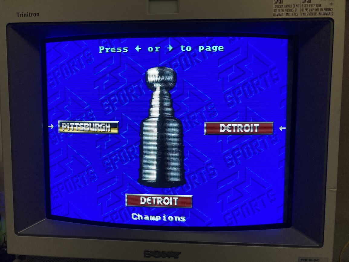
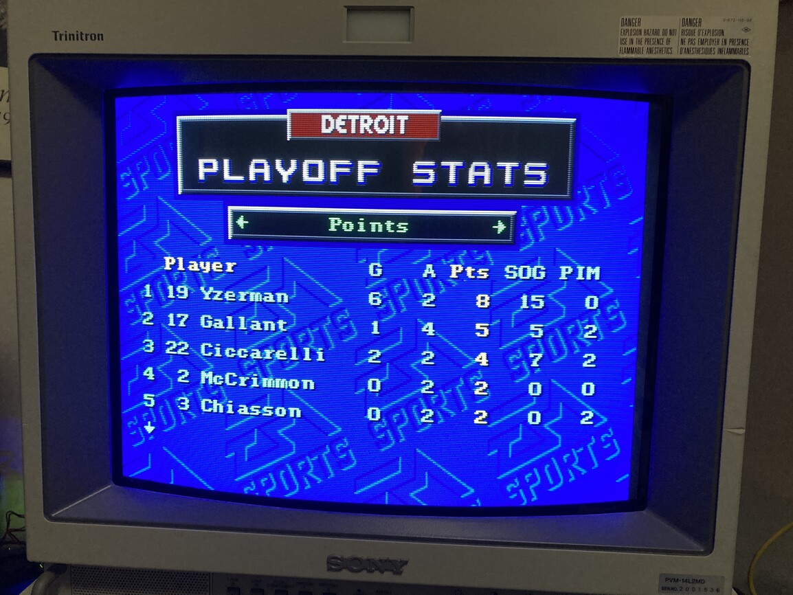
I watched a recent NHL 94 video today so I decided to take the Red Wings to the cup tonight (which is not an accomplishment at all given they’re one of the better teams in the game lol).
Played some Legendary Axe/Makyou Densetsu and its sequel Legendary Axe II/Ankoku Densetsu last night. Blown away by the background graphics in particular via composite output:
First post here. Absolutely love this thread, helped me find some beautiful games as well as just being eye candy. Inspiring me to get a CRT one of these days.
Here’s a quick shot of Marvel Super Heroes vs Street Fighter on the Saturn via RGB and the OSSC on my 4K Samsung LCD that I thought looked striking while playing: