Cyberbots running on the mister. This background, in particular, is rather impressive, they nail the fine detail to help sell the scale of the bots (street lamps, flags, road markings etc) crazy impressive for ‘240p’

6 Likes
I can’t resist - more Sticker Star shots!

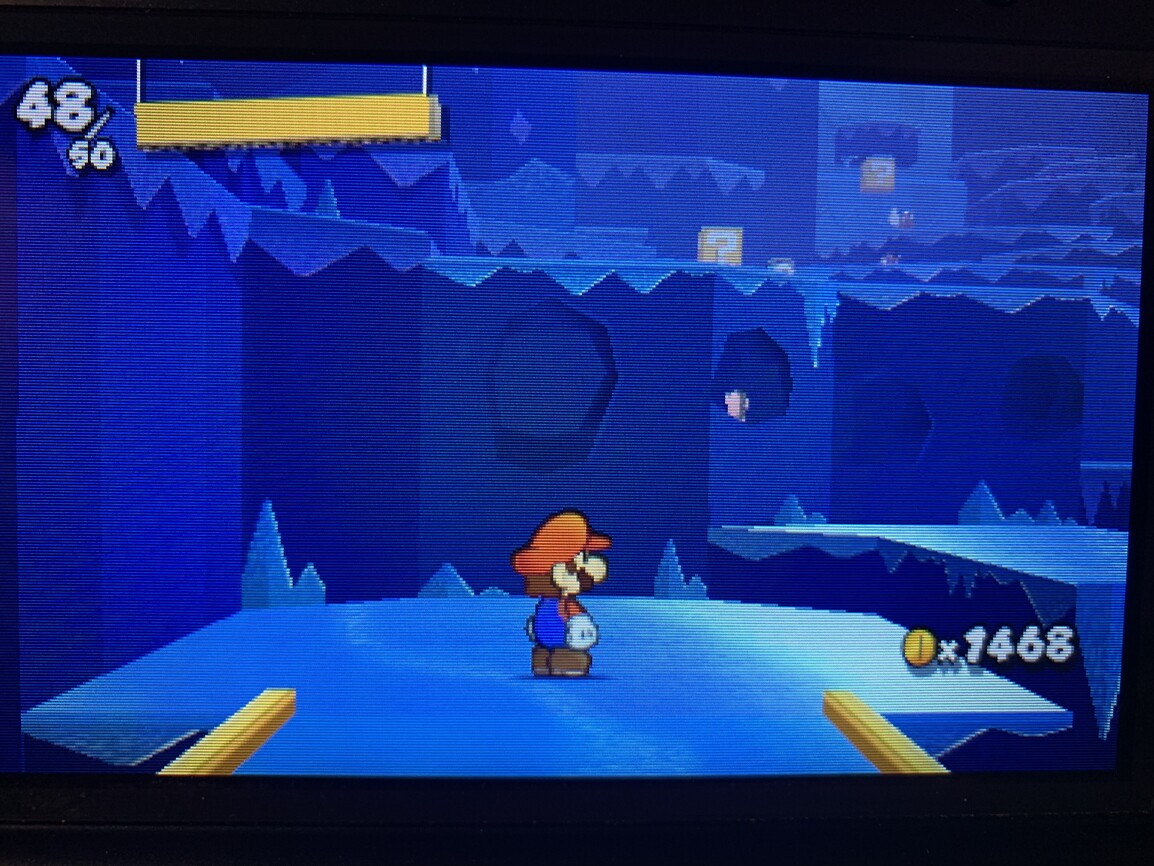


It’s a beautiful game, particularly these icy cavern environments where the icy floor has a very delectable sticker sheen that convincingly moves to the camera. There’s a perfect amount of detail here for the rendering resolution - I’m as impressed with these 240p visuals as I was with The Origami King’s 1080p graphics.
3 Likes
This is nice. Maybe I need a mister.
1 Like


I remember seeing this on a friend’s Amiga, had really impressive parallax going on iirc
@StevieWhite It’s really good, especially if you like me you wished you had a CPS2 but can’t justify having something so big lying around.
MvC - Mister CPS2 beta core:


I’ve not touched MvC since it came out on Dreamcast but playing this and the gap between modern fighters and what was achieved in the peak era of 2D fighters is way bigger than I had thought. These gestures and animations are nearly untouchable. The music switching as your tag character comes in is so damn hype I only wish Capcom had a board with no limits as all those amazing assists like Jubliee could have been fully playable characters T_T
7 Likes
The glow on Mega Man’s feet chefs kiss. One of the aspects of a CRT you just can’t replicate. Almost looks like a 3D model despite being a sprite
2 Likes


Lion King on the Mega Drive uses a lot of the vertical bar dithering as seen in comix zone and Earthworm Jim which is perfect for Mister’s CB option
Off:

On:

Grass and that distant hill no longer look like jail bars! (view full screen)
Treasure’s surreal McDonalds game


5 Likes
- Composite Blending, smooth dithering patterns in games.
Vector Man has this on some objects too.
Yeah, that ‘Jail bar dithering’ is in so many games, I don’t really mind the chequered or patterned dithering but this one is really hard to look past. There’s a whole underwater scene in that McDonad’s game and it’s one big mess, looks amazing with CB on.
Surprised to hear about it in a treasure game. Crazy just how one vertical row of pixels being distinct vs blurry can change the entire composition of a screen like that. But I 100% believe it.
Devs really were just shooting for a “moving target” when it came to how they designed their visuals back then. It’s amazing that they were able to produce such incredible work considering the sheer amount of limitations and unknowns they were working within back then compared to now.
If we didn’t do our best to document this via photos, I think future generations would lose a lot of that context.
1 Like
The use in that particular underwater scene is interesting as it’s a mix of the typical 1x1 pixel chequered pattern (think chessboard) you see artists use when creating water but amongst it are some sections using irregular 1x2 or 1x3 layouts too. These irregular patterns are grouped into horizontal bars that move up and down and distort the art behind it which looks bad without blending but with it on you can see the artists were imitating water refraction, really interesting stuff.
 Color Comparison | VCDECIDE")
This vid came up in my YT suggestions and was why I wanted to try Lion King lol Jail bar dithering is everywhere! Thanks for the suggestion I’ll check out Vector Man soon.
Another great case of dithering tuned for display on CRT are the Japanese Mega Drive versions of the golf games by T&E SOFT.
The different dither patterns look like different grass textures, allowing you to not only gauge rough from fairway but also to see slopes on the green. Really well done.

The USA/Euro versions replaced all dithering with solid colours. There were numerous other flow/control/ui changes to the game to make it more forgiving and - some say - easier to play.
https://www.mobygames.com/game/genesis/pebble-beach-golf-links_/screenshots/gameShotId,324029/

1 Like
Wow, the international release looks much too angular by comparison.
Star successor is my top one. I adore the star fox series games though still.
@Vespa any chance of photos of the above dithered golf game on MiSTer with CB on/off?
I took a few yesterday and only realised late that I was in PAL mode for some shots or that I was using adaptive CB.


Some observations I like about the composite blended image is that the grass gets a pleasing herringbone texture to it (not to mention distant grass looks more pleasing) and the tree has a trunk that looks curved and a bit knotted. Oh, and the golf ball looks the most rounded here too.

Accidentally had Adaptive CB on in this LCD shot so there’s transparency on the direction and map ‘HUD’

Looks a bit stretched because it was in PAL mode
1 Like
Hot damn I love these MD games. So stylish.
Thanks!
